
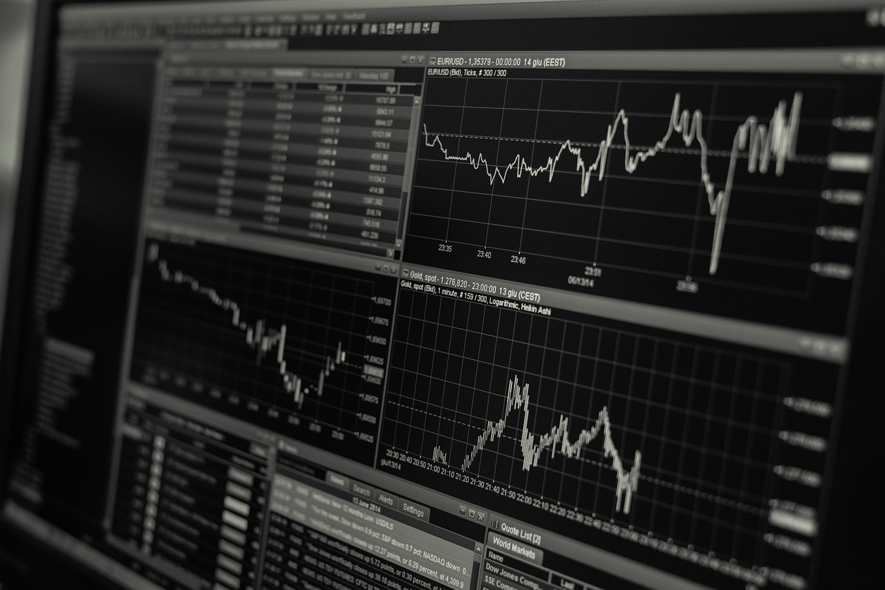
How investors typically interpret charts
Traditional charts are great for tracking a single line over time: price history, performance, or benchmarks. But portfolios aren't one line—they're a collection of positions with different sizes and risks.
Where charts can mislead
A chart can look "fine" even when your portfolio is lopsided. You can be overexposed to one position or sector and still see an upward-sloping line. The line doesn't show dominance or concentration.
- •Performance charts often hide position sizing
- •Pie charts become unreadable as holdings grow
- •Tables require mental math to identify what's driving results
Why visuals improve understanding
Visual portfolio tracking focuses on comprehension speed. Instead of asking you to interpret numbers, it shows a portfolio as a map where size communicates allocation and color communicates performance.
When visualization changes decisions
Visualization changes behavior when it reveals something you didn't realize:
- •A single position has quietly become too large
- •Multiple holdings are actually correlated exposure
- •Your "diversified" portfolio is dominated by one theme
Choosing the right approach
This isn't an either/or. Charts are great for price and time-series analysis. Visual portfolio tracking is great for understanding allocation and risk. The best setup combines both.
Experience visual portfolio tracking on iPhone
PortVisio is designed to give you a visual-first portfolio view on iPhone. It complements your broker and charting tools by answering a simpler question: what does your portfolio look like right now?
Add clarity to your portfolio reviews
If you want faster understanding with less effort, a visual view is the clean upgrade.

Final thoughts
Traditional charts are useful, but they're not built to show portfolio shape. Visual tracking fills that gap. If you care about allocation and concentration, visualization is what actually helps.