Why traditional portfolio views fall short
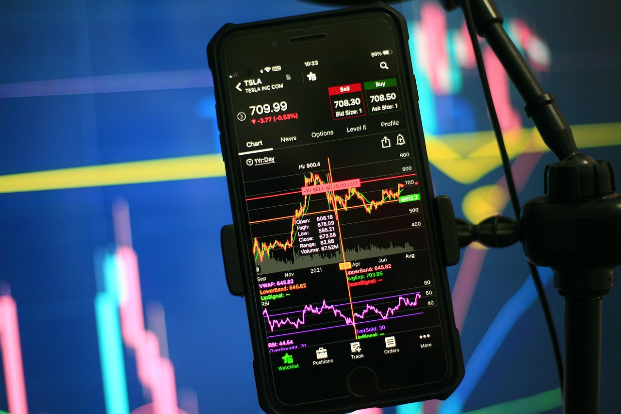
Most investors track their portfolios with one of two tools: brokerage apps or spreadsheets. Both can work early on, but as your holdings grow, the limitations show up fast.
- •Lists don't show structure. A ticker list tells you what you own, not how your portfolio is shaped.
- •Tables hide concentration. Percentages look tidy, but they don't make risk feel obvious.
- •Mobile makes it worse. On iPhone, you scroll instead of seeing the whole portfolio at once.
The result is common: investors feel diversified while being more concentrated than they realize. And when you can't clearly see your portfolio, it's easy to miss what matters.
What "visual portfolio tracking" actually means
Visual portfolio tracking replaces rows and columns with spatial representation. Instead of forcing you to interpret numbers, it shows your portfolio as a visual map where size represents allocation and color represents performance.
Seeing your portfolio visually with PortVisio
PortVisio is a visual-first portfolio tracker designed for iPhone. It helps investors understand portfolio shape, allocation, and risk at a glance.
Visualize your portfolio in seconds
Add a visual layer to your investing workflow and spot imbalances faster.